In this tutorial, I will present the complete code and review several tags and explanations related to creating a basic web page, focusing on the rows aspect. Developing a simple web page—often called the first "Hello World" program, webpage, or app in most tutorials—is a foundational step in any development journey and an excellent introduction for what lies ahead. In today’s world, there are numerous devices, and it’s important to note that your page may appear differently across various screens, particularly when delving into intricate details. So, being simple and somewhat basic is a great practice, but this is opinionated and depends on how much time a person has to update the site.
Here's a link to a printable simple HTML cheat sheet: https://web.stanford.edu/group/csp/cs21/htmlcheatsheet.pdf
It’s super simple, so printing or leaving it open on your device for reference is good. And then there is always Google. The wording of the search is the key, and usually, at the top, you will see the AI response. So try a search: HTML, Google how to place images on a webpage.
Anyway, let’s get started! We will start with a basic template and add a few extras to it.
Ok, so first, I want to explain the tags. If you see the <html> and </html>. Or the <h1>, </h2>, <p>, </p>, etc. it is pretty simple. Between the tags, it is as if you are ordering from the menu at your favorite restaurant. The tags are like talking to the waitstaff and explaining what you want to order.
Additional options can be added to each tag. For instance, <textarea style="height:600px"> is just <textarea> with some directions. So where it says “style=,” we are saying this is how tall you want the text area. Very simple, especially with the style/CSS part of the tag. Once most of the language starts to become like the language you speak, the page will do, like I said earlier about the ordering concept. Add what you want to your burger. Lol!
I also want to point out the <!-- comment about something -->. It is just like leaving a note for yourself or, potentially, if you are collaborating with another person on a project.
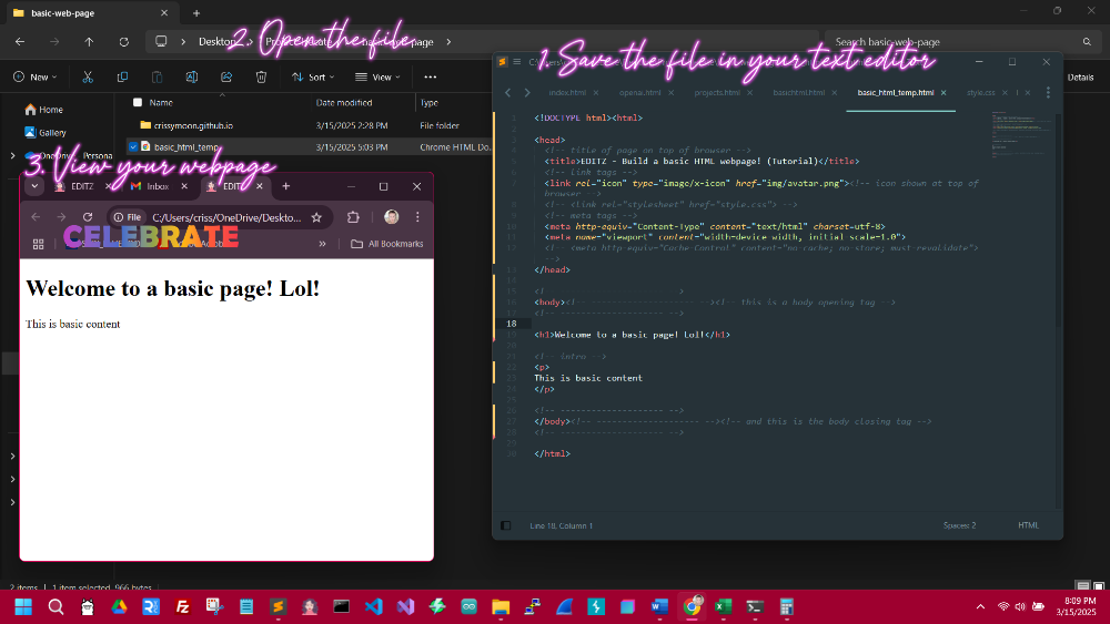
Moving on, you can click the Click here to copy button to copy the code and paste it into your favorite text editor. It will work in a basic notepad as well. You are just making sure to save it as “yourfile.html.” However, it is way better to use a source code text editor. If you don’t already have one, go to the Helpful Links page and pick one or do a search for it on Google. Sublime Text is my recommendation; it is free, and you will get a prompt sometimes asking for a donation if it is unregistered. However, it is very well worth donating, and even without it, there is no restriction on its use.
The rows aspect:
This is pretty simple. It is just like you are reading this content right now. The words go left to right, and once the width of the line reaches the end of the window in your web browser, it goes to the next row. So, it's best to remember that you should start from the top and work your way down.
Example (kind of like a spreadsheet):
Row 1: Column 1, Column 2, Column 3, ->
Row 2: Column 1, Column 2, Column 3, ->
The code above should be in your text/source code editor and saved to your device. All that's left to do is open it. It won't be anything spectacular at the moment, but the concept of putting information into the web browser is now a possibility 😊
Well, that's it for this tutorial. I will recap and offer a possible challenge and a few hints. I am also adding a feature to this page called down-to-earth definitions, which are just a simple way of defining terms.
Recap:
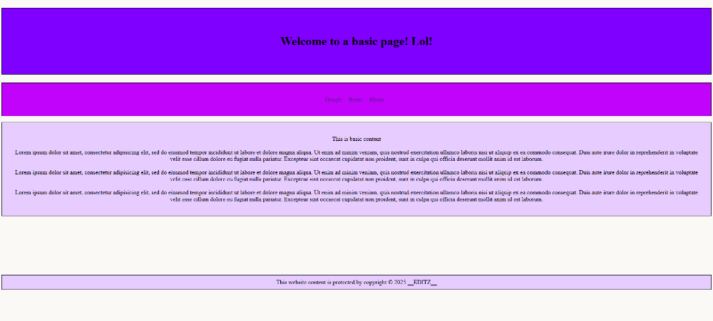
The HTML code was entered into a text or source code editor. Various tags were employed throughout the organized code, reflecting the row concept. Comments were strategically placed within the coding to promote clarity and facilitate understanding of each element, ensuring that future work on the page aligns with the initial thought process leading to its publication. A degree of styling was applied to enhance the layout and structure of the provided data and content. While the resulting page may not be deemed “award-winning,” it maintains simplicity and responsiveness and offers substantial potential for future modifications.
Hints and Tips:
Creating a comprehensive list of all desired features for your webpage, whether on paper or in a digital format such as, in a notepad or a word processing document—is always a great idea. The number of items required in a navigation bar or menu often necessitates various styles prioritizing aesthetic appeal, ensuring a balanced presentation while maintaining an organized layout. An excessive number of elements may lead to visual clutter. If it is essential to include numerous items due to advertising requirements or to adequately convey the subject matter, consider employing them row by row, utilizing varying colors that align with your established theme. Creating a separate page, like a “part two,” can also accommodate additional content. This analogy can be likened to a scenario in a living room with limited seating. If there are five seats for ten individuals, the environment can become cramped, detracting from the audience's ability to engage with the presented material. It is essential to recognize that multiple coding variations can achieve similar results. Strive for functionality over perfection, as the website can be seen as a unique expression of your vision. While I could elaborate further on this topic, I will conclude here with maintaining clarity and elegance while also emphasizing the importance of finding enjoyment in the process, ultimately enhancing the outcome and allowing for more innovative outcomes in the future.
**Down-to-Earth Definitions**
Responsive: This basically just means your webpage will be able to shrink or grow when used on a mobile device or a larger desktop screen. Responsiveness is essential if you create a website for selling items or something highly utilized on mobile devices, like search websites—Google or Bing. No matter how small the screen is, it somehow works.
Meta Tags: Very simple! It is information that is like spoken to the web browser to handle many different actions, such as supporting Unicode or characters that are sometimes considered illegal. For example, characters that are not usually allowed in website usernames. Or the “viewport” meta tag, which is used mainly to make the page look better on a mobile device. It is included in the source code above, and that specific code arrangement is prevalent on webpages. It just fits everything better, considering the screen size.
Complete List of Meta HTML Tags: https://gist.github.com/whitingx/3840905
**Challenge(s)**
The challenge for this project is to enhance it to the best of your ability. You may have noticed that the footer currently lacks styling. See if you can apply some CSS within the style tags to improve it. Additionally, exploring everything possible is an excellent approach to deepening your understanding. Writing and reading code, along with watching relevant YouTube videos, reading, or attempting tutorials, are effective ways to keep up with the ever-evolving landscape of programming methods, aside from formal education or training. Don't forget to try to incorporate images into the page (<img src="img/avatar.png" width="200">). I recommend creating a folder called “img” in the exact location as your website page—just drop an image in there and change the “avatar.png” to the name of the image. As a general starting point, sketching ideas with a pen and paper is helpful—then work toward something unique.
Keep checking back for more content, or if you have anything you may like to see on here, email: CrissyMoon711@gmail.com